|
| 30+ PAINT SAMPLES. Since buying our new house, I have considered going a lot of different directions with our living room (actually our whole house remodel) so I tried out a lot of different paint colors in the living room to see how they felt. I finally decided I want deep blue walls. You can read about how I made that choice and how I started this project in Part 1 HERE. Now, is trying out 30+ paint samples for one room a bit nutty? Yes. But, color really does affect my mood greatly so I want to find a good color and also, at least it was just samples. It's not like I painted the whole room different shades of the same color SEVEN TIMES or anything. *cough* Like I did in our first house *cough* Believe me, my husband has his fingers crossed this living room process won't be a repeat of the never ending (or it felt that way) search for the right shade of green for the family room in our old house. I've got my fingers crossed, too, to be honest. We tested out a bunch of blues and went with Sherwin Williams Byzantium. It is over the mantel in the picture above. |
 |
| PLEASE EXCUSE THE MESS. Since we bought the house the living room has been a storage room to my husband's dismay. I've cleared out a LOT of boxes from the room to be able to start the painting project. This is actually an improved version of the room. I know. Pretty embarrassing, huh? I'm shocked I'm allowing you to see our house this way. My husband is pretty thrilled to see any progress. He says he has high hopes of one day actually being able to sit down in an empty seat in the living room. I told him to keep hope alive. LOL! Anyway, there is our yellow damask sofa. We just recovered her before we decided to sell our old house and I am not ready to part with her yet, so she's staying. Whatever color we go with, has to compliment her. |
 |
| DO YOU WANT THE GOOD NEWS OR THE BAD NEWS FIRST? The good news is my husband and I both liked Sherwin Williams Byzantium. It is a beautiful blue. The bad news is that we both agreed it was not dark enough to make the room pop the way the walls in my inspiration pics did. My husband was the first one to say it and I think he expected a very bad reaction from me since I had already painted a lot of the room, but I wasn't upset at all. It was just the truth. We have to go darker. |
 |
| BENJAMIN MOORE "DOWN POUR BLUE" ENTERS THE STAGE. My husband and I went to the color wheels and looked at all the different choices. I considered Benjamin Moore Patriot Blue, but then decided to go with Benjamin Moore Down Pour Blue because it seemed more interesting. When I put it up on the wall, I freaked out a bit when I saw how dark it is. I usually find dark colors very gloomy. I would never in a million years have guessed that I would paint my living room walls (or really any walls) a dark blue. I got it in semi gloss. I'll let you know how it goes. Keep your fingers crossed for me. |
 |
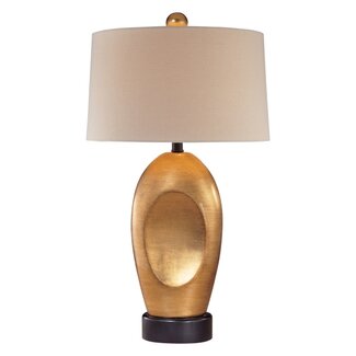
| NEW MODERN STYLE LAMPS. By the way, I ordered 2 of these lamps for the living room. Originally, I was looking for gold lamps with chain links, but then I saw these and thought I'd see how I like them. |
 |
| LIKE THIS, BUT NOT AS TALL. I got the idea for gold leaf chain link lamps when I saw a lamp like this on sale at Last Call here in Austin, but it had only 2 large links. I thought it looked cool. |
 |
| A DIFFERENT DIRECTION. I also thought about getting 2 orange lamps like these. I love the color orange and once I thought about doing deep blue walls, I also decided I would have some orange accents in the room one way or the other. If I don't get orange lamps, then I may use throw pillows, orange velvet chairs or paint an end table orange. I am not sure how they will look with my yellow sofa, but I hope they will work somehow. |
A CHANDELIER. I am also in the market for a chandelier for the living room. I have a LOT of different ideas for it, but lately, I've been thinking about a metal/gold leaf drum. I saw the one below. My husband made a face when I showed it to him. He wasn't digging it. I'm not sold on it exactly, but it is staying with me so I haven't ruled it out either. Also? I'm worried about OD'ing on the gilt in the room at some point. I am going to use some gold leaf sconces Reba gave me for over the mantel and I am even toying with a gold leaf glass coffee table. Hmmm. So many options.
If you have some ideas/feedback, then please share it. I won't get my feelings hurt even if you say you hate it all. I would honestly appreciate hearing views especially if someone can tell me *WHY* they don't like it. It will help me think thru my choices.
WRITTEN BY ELDAROSE
 |
| Part 3 of my Living Room Project is HERE |
The party I plan to join when I finish.

Post linked to:
![]()