
 |
| 30+ PAINT SAMPLES. Since buying our new house, I have considered going a lot of different directions with our living room (actually our whole house remodel) so I tried out a lot of different paint colors in the living room to see how they felt. I finally decided I want deep blue walls. You can read about how I made that choice and how I started this project in Part 1 HERE. Now, is trying out 30+ paint samples for one room a bit nutty? Yes. But, color really does affect my mood greatly so I want to find a good color and also, at least it was just samples. It's not like I painted the whole room different shades of the same color SEVEN TIMES or anything. *cough* Like I did in our first house *cough* Believe me, my husband has his fingers crossed this living room process won't be a repeat of the never ending (or it felt that way) search for the right shade of green for the family room in our old house. I've got my fingers crossed, too, to be honest. We tested out a bunch of blues and went with Sherwin Williams Byzantium. It is over the mantel in the picture above. |
 |
| PLEASE EXCUSE THE MESS. Since we bought the house the living room has been a storage room to my husband's dismay. I've cleared out a LOT of boxes from the room to be able to start the painting project. This is actually an improved version of the room. I know. Pretty embarrassing, huh? I'm shocked I'm allowing you to see our house this way. My husband is pretty thrilled to see any progress. He says he has high hopes of one day actually being able to sit down in an empty seat in the living room. I told him to keep hope alive. LOL! Anyway, there is our yellow damask sofa. We just recovered her before we decided to sell our old house and I am not ready to part with her yet, so she's staying. Whatever color we go with, has to compliment her. |
 |
| DO YOU WANT THE GOOD NEWS OR THE BAD NEWS FIRST? The good news is my husband and I both liked Sherwin Williams Byzantium. It is a beautiful blue. The bad news is that we both agreed it was not dark enough to make the room pop the way the walls in my inspiration pics did. My husband was the first one to say it and I think he expected a very bad reaction from me since I had already painted a lot of the room, but I wasn't upset at all. It was just the truth. We have to go darker. |
 |
| BENJAMIN MOORE "DOWN POUR BLUE" ENTERS THE STAGE. My husband and I went to the color wheels and looked at all the different choices. I considered Benjamin Moore Patriot Blue, but then decided to go with Benjamin Moore Down Pour Blue because it seemed more interesting. When I put it up on the wall, I freaked out a bit when I saw how dark it is. I usually find dark colors very gloomy. I would never in a million years have guessed that I would paint my living room walls (or really any walls) a dark blue. I got it in semi gloss. I'll let you know how it goes. Keep your fingers crossed for me. |
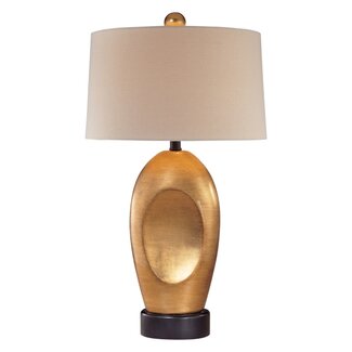 |
| NEW MODERN STYLE LAMPS. By the way, I ordered 2 of these lamps for the living room. Originally, I was looking for gold lamps with chain links, but then I saw these and thought I'd see how I like them. |
 |
| LIKE THIS, BUT NOT AS TALL. I got the idea for gold leaf chain link lamps when I saw a lamp like this on sale at Last Call here in Austin, but it had only 2 large links. I thought it looked cool. |
 |
| A DIFFERENT DIRECTION. I also thought about getting 2 orange lamps like these. I love the color orange and once I thought about doing deep blue walls, I also decided I would have some orange accents in the room one way or the other. If I don't get orange lamps, then I may use throw pillows, orange velvet chairs or paint an end table orange. I am not sure how they will look with my yellow sofa, but I hope they will work somehow. |
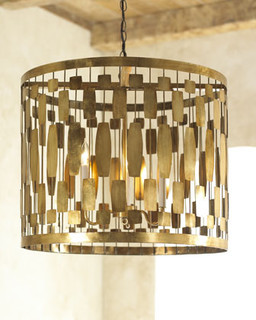
A CHANDELIER. I am also in the market for a chandelier for the living room. I have a LOT of different ideas for it, but lately, I've been thinking about a metal/gold leaf drum. I saw the one below. My husband made a face when I showed it to him. He wasn't digging it. I'm not sold on it exactly, but it is staying with me so I haven't ruled it out either. Also? I'm worried about OD'ing on the gilt in the room at some point. I am going to use some gold leaf sconces Reba gave me for over the mantel and I am even toying with a gold leaf glass coffee table. Hmmm. So many options.
If you have some ideas/feedback, then please share it. I won't get my feelings hurt even if you say you hate it all. I would honestly appreciate hearing views especially if someone can tell me *WHY* they don't like it. It will help me think thru my choices.
WRITTEN BY ELDAROSE
 |
| Part 3 of my Living Room Project is HERE |
The party I plan to join when I finish.

Post linked to:


First, thank you so much for stopping by and I truly appreciate you taking the time to comment. Second, it's hard picking just the right color. Paint is a tough thing and depending on the light and the time of day it can read completely differently. Go with your gut...if you love it initially you will love it in the end. I love all of your ideas so far. Good luck with it all.
ReplyDeleteJudy,
DeleteYou are so welcome. I'm sorry I didn't comment sooner. I've admired your clever ideas for awhile now. And yes, picking the right color is BRUTAL for me. Thanks for your understanding. :D
Eldarose
I love both the shades of blue although "Down Pour Blue" will definitely make your beautiful damask sofa stand out. You have very classic taste so I'm sure the end result will be beautiful and both you and your husband will enjoy the journey!Loving the first gold lamp you ordered, it will be perfect for your room and I like the trendy drum shade chandelier:)Thanks for visiting me and leaving such a sweet note. Have a lovely weekend!~Poppy
ReplyDeletehttp://withadashofcolor.blogspot.com/
Poppy,
DeleteThank you so much for visiting and leaving a comment. I have put up the Down Pour Blue and I am even more sure that darker was the way to go. We got the gold lamps and I LOVE them.
I visited your site and love your posts so much.
Sincerely,
Eldarose
Oh boy choices choices choices. I love blue in any variation. I see the look you are going for and I agree the darker in the blue is the better way to go. You have a light couch so this is perfect. Thanks for sharing with my newbie party.
ReplyDeleteDebbie,
DeleteI went with darker and it was the way to go. Thank you for hosting the newbie party and allowing us to link in.
Eldarose
Love bold color choices!! It's all about the lighting. I like the darker blue - can't wait to see it at our Impossibilities Challenge on Tuesday!
ReplyDeleteKelly
Kelly,
DeleteI agree, the lighting is so important. It can change the appearance of the wall color dramatically.
I went darker and I am tempted to go even darker.
I do like it a lot.
Thanks for visiting and leaving a comment.
Eldarose
I love both colors. Please post again when you get the new paint on.
ReplyDeleteThanks so much. I just posted the progress. I am digging the dark blue even more than I thought I would.
DeleteEldarose
Can't wait to see the result! Have a great week!...hugs...Debbie
ReplyDeleteDebbie,
DeleteThanks so much for visiting and leaving a comment. The room isn't done, but I posted an update for the challenge I entered. It was a lot to do in a short time. But, the deadline was good to get me motivated to get stuff done. Hopefully, I will finish it in the next 10 days or so. I'd love to have it done "done" by Valentine's Day.
Eldarose
You know, I'm right there with you on the darker colors usually being very gloomy to me. I've seen some examples that worked but not too often and usually there has to be a lot of white in the accessories to make it all work for me. I genuinely hope the color works for you though. Your couch is gorgeous and will really stand out against the blue. I would be a little careful with too much orange, if it were me, and would aim more for lighter oranges rather than dark ones. An orange that's too dark might not work well with the lovely gold tones in your couch and can clash against the blue since they're complimentary colors. Softer oranges toward the brighter end of the spectrum might really tie well with your couch though.
ReplyDeleteRebecca,
DeleteThank you for your thoughtful comments. I will definitely consider the gold tones now when I pick the orange accents for the room. It is nice to get someone's comments who may not particularly like the direction I'm going in because it helps me spot pitfalls in it. I want the room to be inviting to guests.
Eldarose
I know the feeling, I generally takes me forever to decide on colors, and then I still put off the process until I'm sure it's what I want. I can't wait to see the ending results. I'm your newest follower. Good Luck
ReplyDeleteSherry,
DeleteYes, picking colors for walls is brutal for me. Thanks for visiting and leaving a comment. I don't see you added on Google as a follower, but maybe you are following via email. Reba and I are following your blog now, too. :D
Eldarose
nice bLog! its interesting. thank you for sharing....
ReplyDeleteCrystal Chandeliers Sale